Part of my goal here on Substack is to document this slice of my life. I don’t know what it is, but I love to leave a paper trail. And for me, it is very much about the journey rather than the destination. I firmly believe that through the process of writing, we can find ourselves. I find myself, anyway. With my lists and my scribbled sticky notes and my planner and my notes app, by bringing my ideas, worries, and plans into physical existence as words on paper, I figure out what matters to me. I figure out where I want to spend my very limited time and energy. And I suppose I hope that this idea resonates with someone, because isn’t the core of being human wanting to connect with others? Feeling like we are not alone?
In 2020, when the rest of the world also took to the internet for distraction and connection, I started an Instagram account to share the home we had just moved into two weeks after my daughter was born. That, of course, wasn’t the plan, but we very quickly learned that home renovations rarely go according to plan. (This is a story for another day.) I took a year-long maternity leave from teaching, and building a little online documentation of our home was a welcomed outlet for what I later realized was a need to create.
One of the decisions about our home that I endlessly poured over was paint colors. Some of the colors remain the same as they were when we first renovated it, but some rooms we have since painted. (By “we,” I mean my husband, who, with minimal grumbling, has embraced my newfound love of DIY projects.)
I am very particular about color. I find most reds and oranges to be abrasive and have a general dislike for pinks and purples. (Although I am finding myself liking shades of mauve lately—life is a wild ride, isn’t it?) I very much gravitate towards blues, greens, and neutral shades. As a somewhat anxious person, it is clear that I lean toward what I find to be calming tones. And for our home, my three guiding principles are these: beauty, comfort, and calm. I want everything in our home to contribute to one (if not all three) of these ideals.
So, how do you pick a paint color? I can’t tell you exactly (because they are such personal things, our homes), but I can share our paint colors and then a few general tips that might be useful.
Without further ado, here is the current paint color palette of our home: a documentation of the walls that currently surround us, memorialized on the internet.
Have you noticed a trend? I like what I like! Although we have eight different paint colors (not including the trim and stairs, in which case, ten paint colors), they all are clearly in the same neighborhood of blue, green, brown, and gray. The photos below depict each color in the same order in which they appear above and the name of each color is given in the caption.
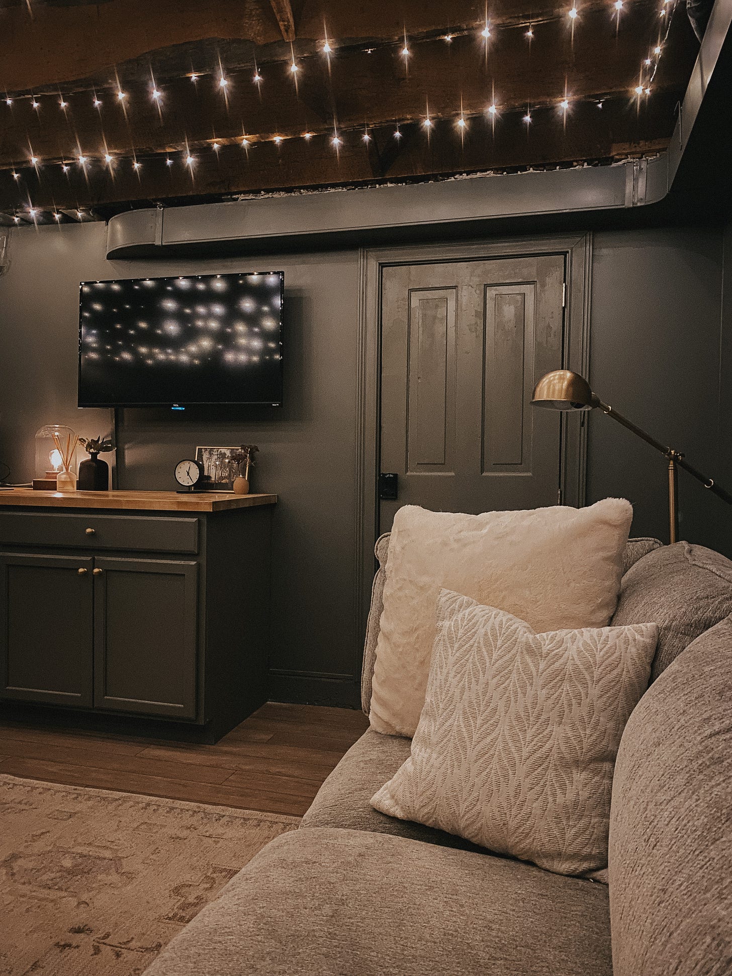
This is our basement, with very little natural light. The color, SW Thunderous, appears much less saturated in daylight. Still, it is a rich muddy, gray-green color that is quite cozy and looks great on a Zoom call (my husband gets many compliments on it).
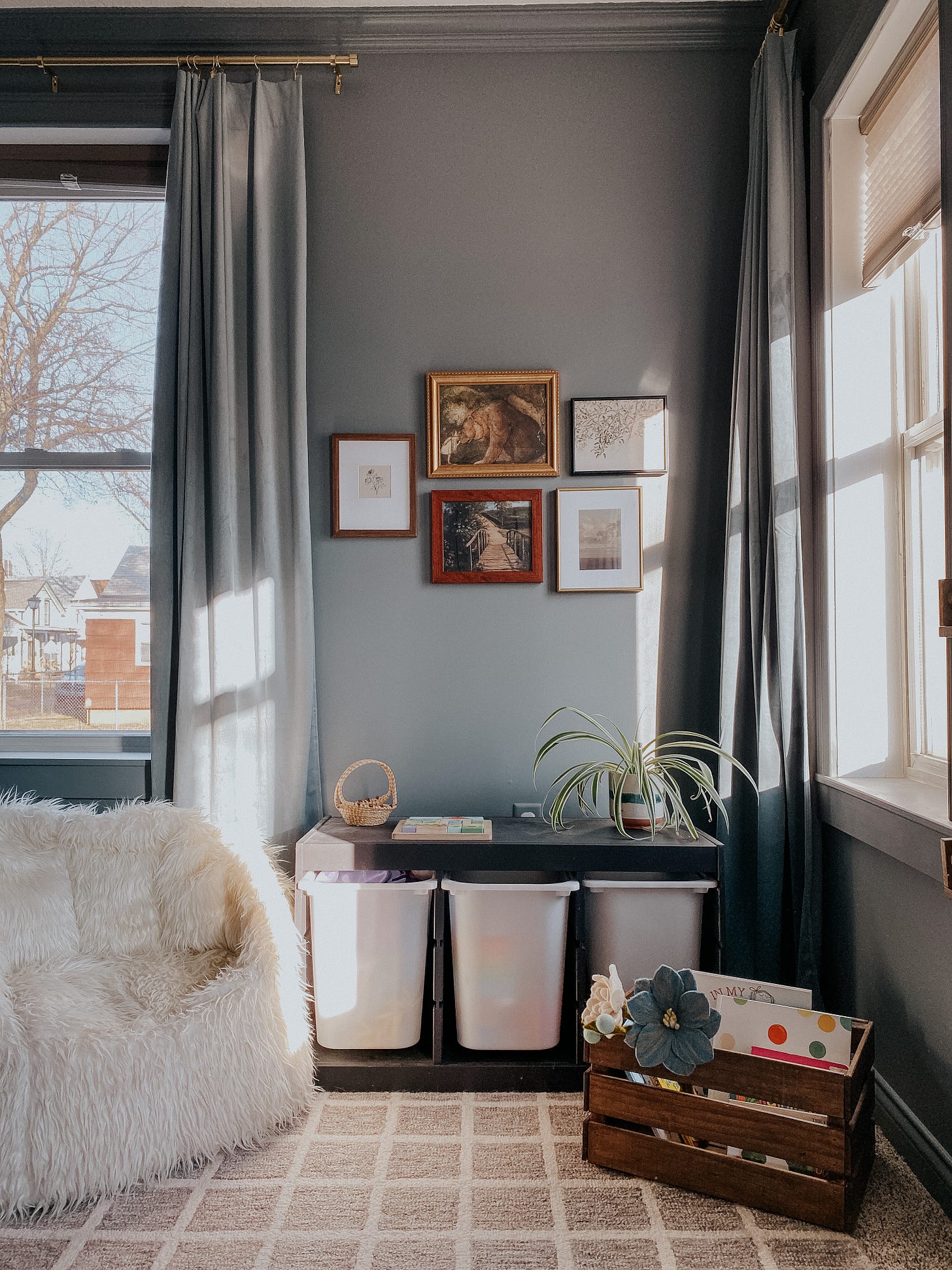
I tested SO MANY blues for my three year old daughter’s room. I wanted something powdery and muted, bold but also feminine. SW Portsmouth, my fifth paint sample, was finally a winner.
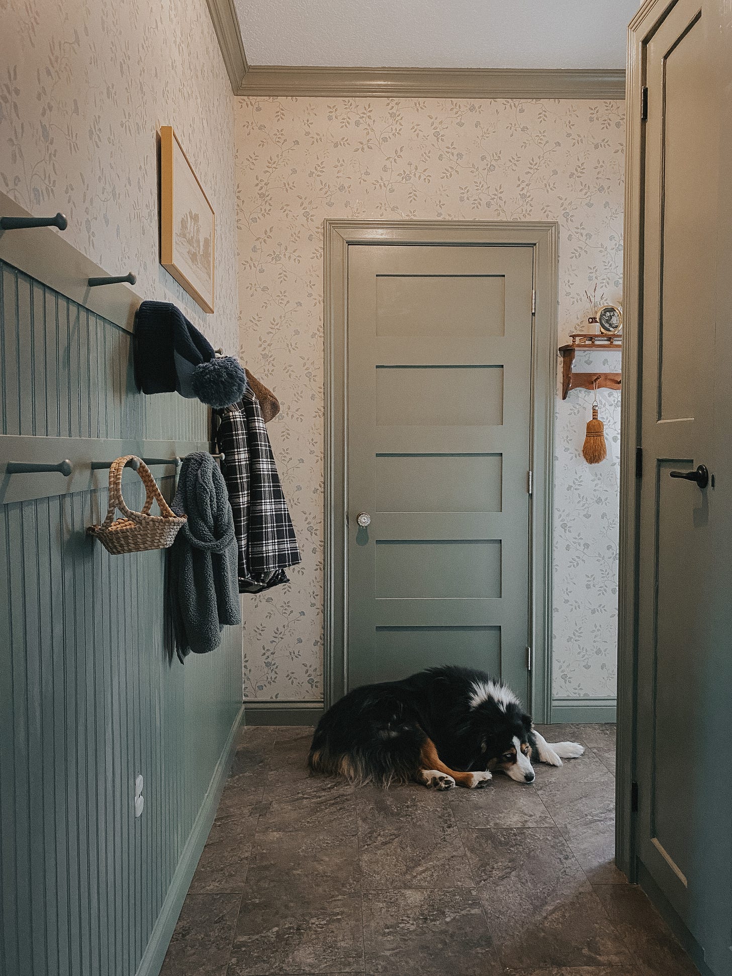
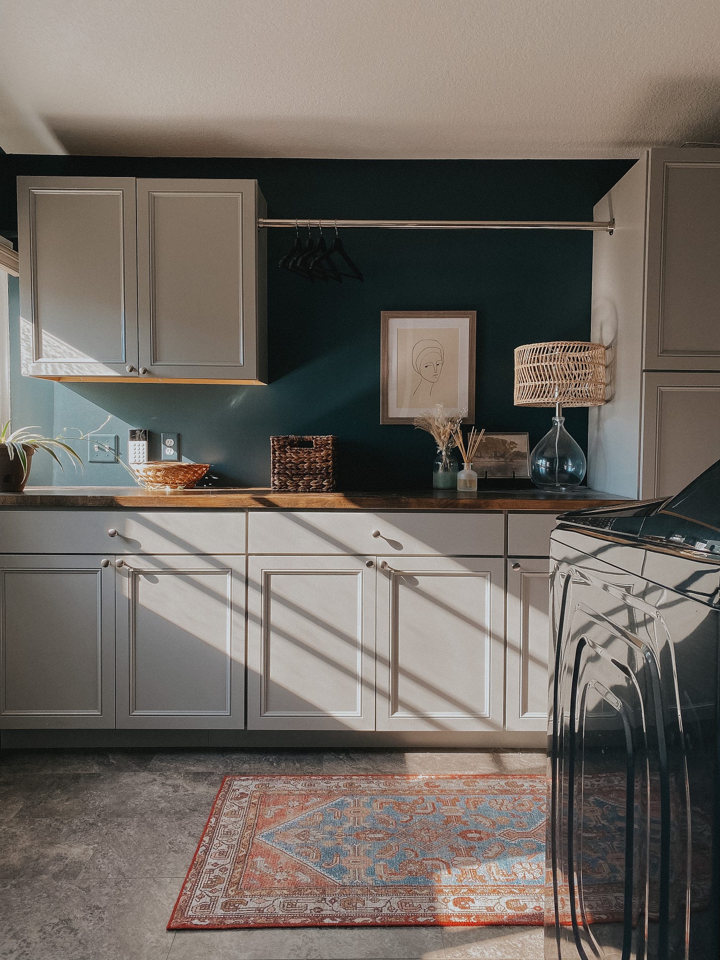
This paint color by Link Paint came from an Instagram collaboration. It’s such a pretty sage green, and it looks different depending on the lighting. This is our pantry hallway. In shadow, the color is very cool, and almost picks up blue undertones. However, in the sun (pictured below in our nursery) it is very much a classic sage green.
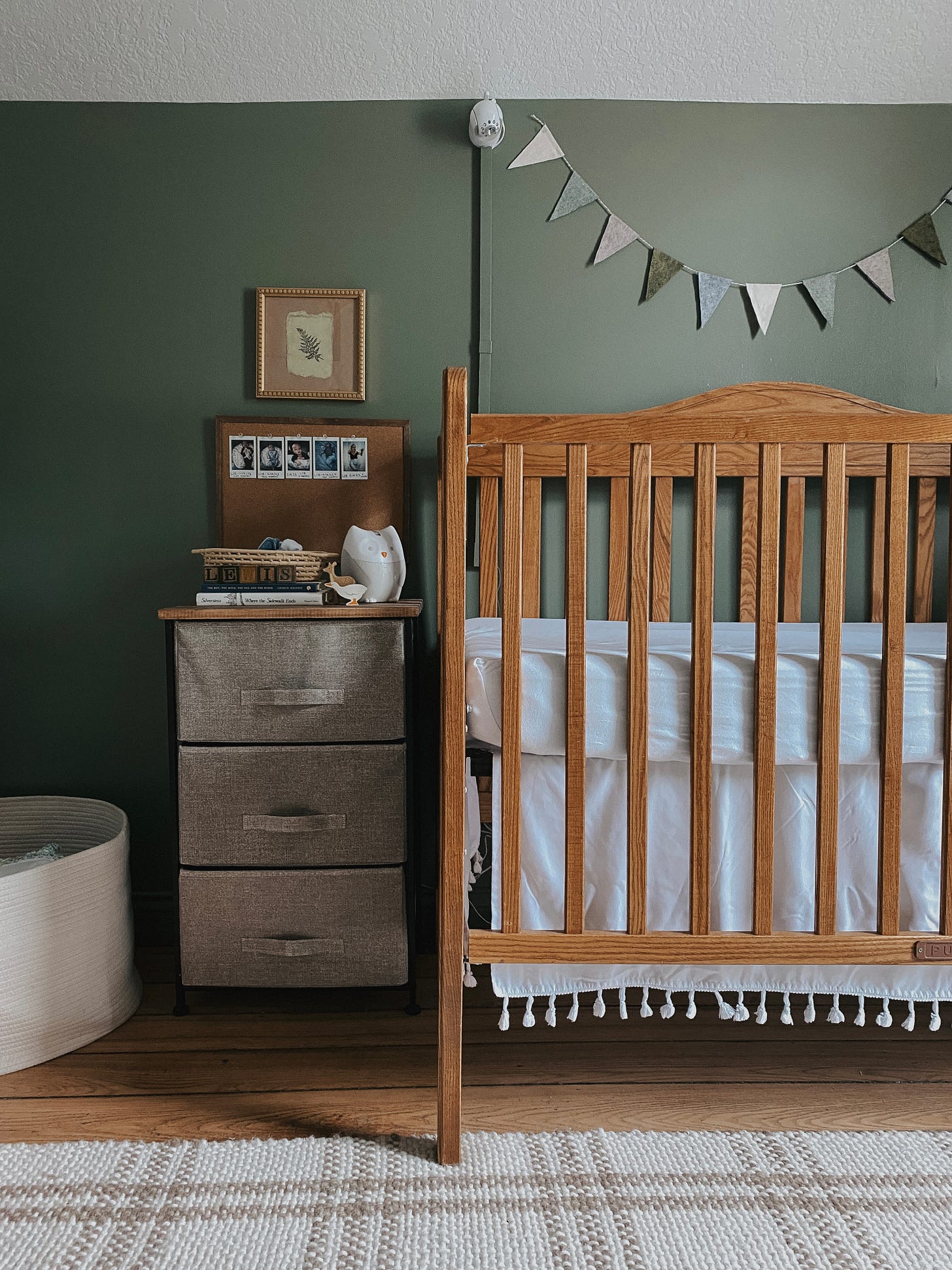
We updated our nursery for my son’s arrival in December of 2022. I absolutely love this color, and think it would work well for a girl’s or a boy’s room.
Home decor Instagram will tell you to get rid of “builder-grade beige,” but there’s something inviting to me about a neutral beigey-gray. This photo was taken in the evening, but SW Mindful Gray leans warm in most lights.
I saw SW Mount Etna in an photo on Pinterest and I instantly fell in love with it. It is a beautiful blue with green and gray undertones. I’ve repeated this color with our kitchen cabinets, too. (Not pictured because although we’ve finally finished adding shiplap backsplash, we’re solid members of the 90% club and need to put up shelving still. One day!)
This color is a true navy. It makes our master bath feel like a perfect oasis of calm.
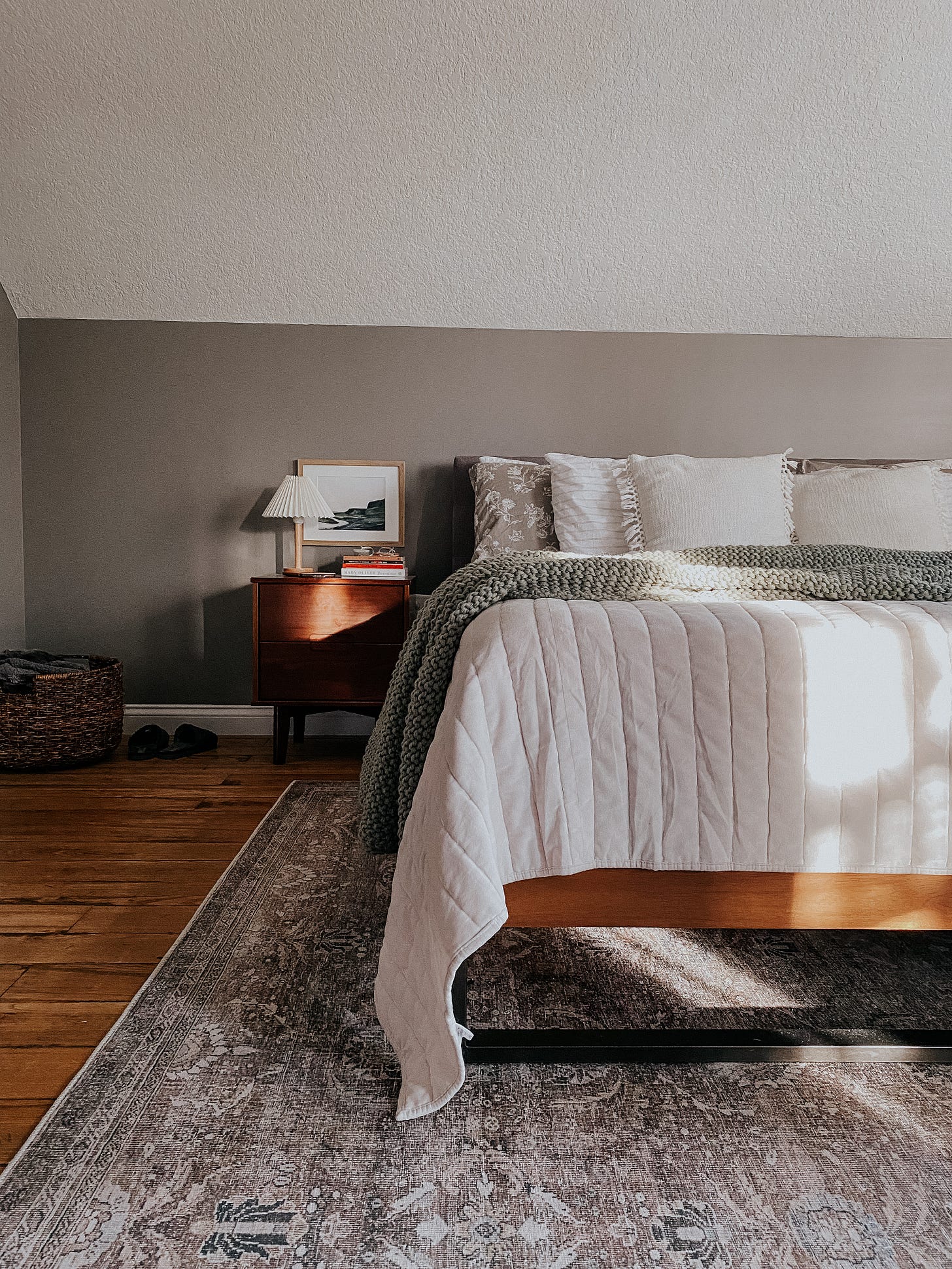
SW Dovetail is a cool brown/warm gray, depending on lighting. To me, it most often reads as a cool brown. We have it in our master bedroom and I find it very soothing.
More home photos can be found on my Instagram.
And to close, here are some paint selection tips (from an amateur interiors enthusiast):
So how do you figure out what you like? Spend time on Instagram or Pinterest and save photos of interiors that you are drawn to. As your collection of saved photos grows, you’ll likely notice a trend. Do you prefer white walls—a blank canvas—or do you crave color? And if it is color you want, do you innately desire bold or soft colors?
Consider choosing a muted shade. Colors always appear more vibrant on the wall than they do on the paint sample card.
Take your chosen color for a test drive. Paint a swatch on the wall and watch it over the course of a full day. How does it change in different lighting?
Rich, bold colors make a room more cozy, I promise. Don’t be afraid! (Yes, even if the room is small.)
If you want to use many different paint colors, consider what “color story” you are telling. Do they all play together well, especially adjacent rooms?
I enjoyed pulling these photos to share, because what immediately stood out to me was the fact that nearly every single one of these spaces has changed in some way since the photos were taken. When we first moved in, I wanted to hurriedly fill every space, make every decision. I wanted to be settled. Since then, I’ve acknowledged that nothing ever has to be finished or final, unless I want it to be.
I think our homes will constantly evolve as we evolve. Home becomes yours the more you-ness it absorbs. It is a process. And I find a lot of satisfaction in documenting the process and reflecting on what my home (and I) are becoming.




You've created the most beautiful home - and such a rich aesthetic within it!
I think documenting life is a great approach with social media - partly because puts the concentration on the process rather than a pressure on the result.
I don't know if you ever came across Austin Kleon's "Share Your Work" - but I think you'd love it Courtney!
All the best from Berlin,
Jim
It turns out we have the same paint colors in our homes! I see myself in your palette.